
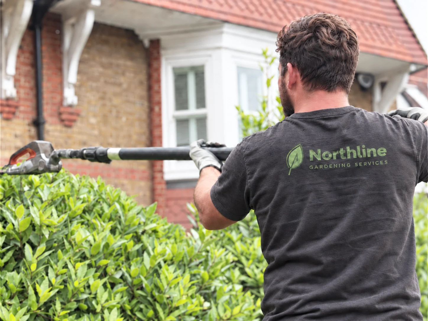
Workwear
Print on a mid-grey marl is the hardest test of a green palette, and the simplified leaf survives it: one flat tint, no thin internal lines to fill in, and a wordmark open enough to stay legible across a moving back.
Case studies — Northline Gardening Services
Northline already had the foundations of a recognisable identity: the green colour, the leaf and the company name. The problem wasn’t that everything needed changing. It was that the logo no longer looked as professional as the business using it.

The original logo had the right idea, but the individual elements didn’t work together strongly enough.
The leaf felt oversized, the typography lacked confidence and the overall shape became awkward when the logo was applied to things such as vehicles, workwear and signage.
Rather than replace everything, we looked at what customers could already recognise and built from there.
The green stayed. The leaf stayed. The Northline name stayed at the centre of the identity.
Those were useful parts of the existing logo, so there was no reason to throw them away.
We simplified and reduced the leaf so it worked with the name rather than overpowering it.
The typography was replaced with something cleaner and stronger, and the spacing and proportions were rebuilt from scratch.
We also created versions of the logo designed to work in different spaces, rather than expecting one layout to fit everything.
The refined mark establishes a repeatable visual language: a defined palette, controlled typography and a logo structure that can be used consistently.
A gardening identity gets judged from a pavement and over a hedge. These are the two places the refined mark does most of its work.
Print on a mid-grey marl is the hardest test of a green palette, and the simplified leaf survives it: one flat tint, no thin internal lines to fill in, and a wordmark open enough to stay legible across a moving back.
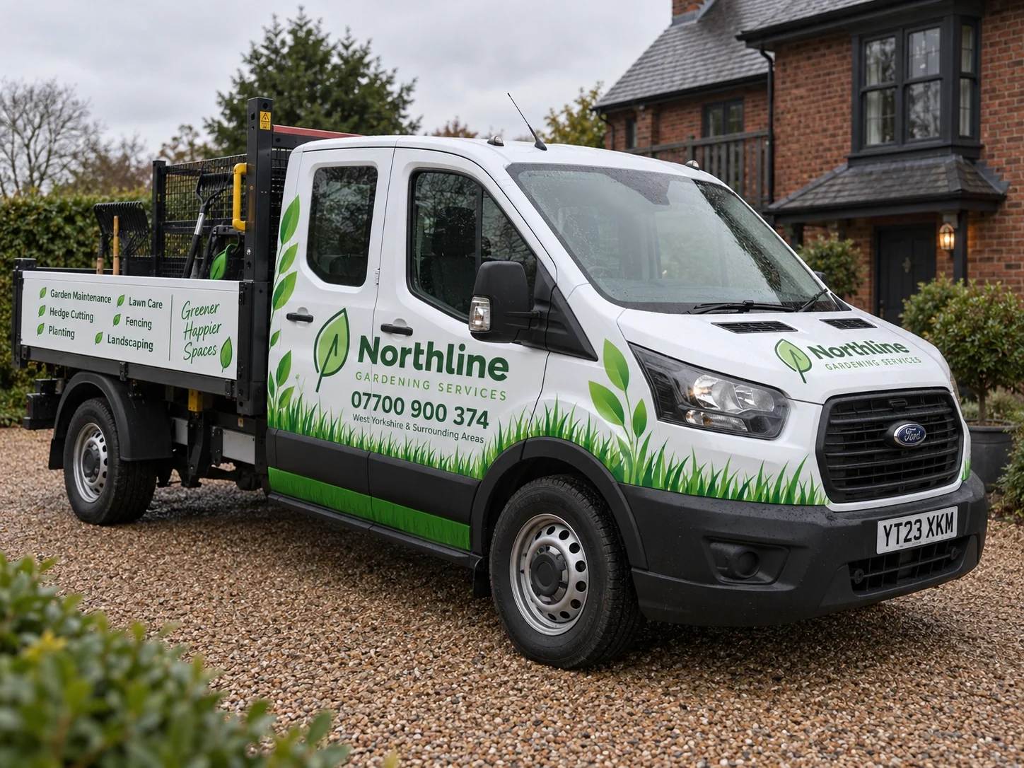
The horizontal lockup is what makes this panel work — name and service line sit above the number without stacking, and there is room left for the service list on the drop side. The grass and leaf motifs extend the identity without competing with the mark.
Northline still looks like Northline. It just looks like a more established version of it.
The new identity is clearer, more confident and much easier to use across vans, clothing, print and digital materials.
Same business. Same recognition. Better impression.
Every project here follows the same principle: keep what customers already recognise, rebuild what is holding it back. See all case studies →
Northline Gardening Services
Current study
 Hardy Plumbing
Read the study →
Identity 03
Hardy Plumbing
Read the study →
Identity 03
 AnswerReady
Read the study →
AnswerReady
Read the study →