
Business cards
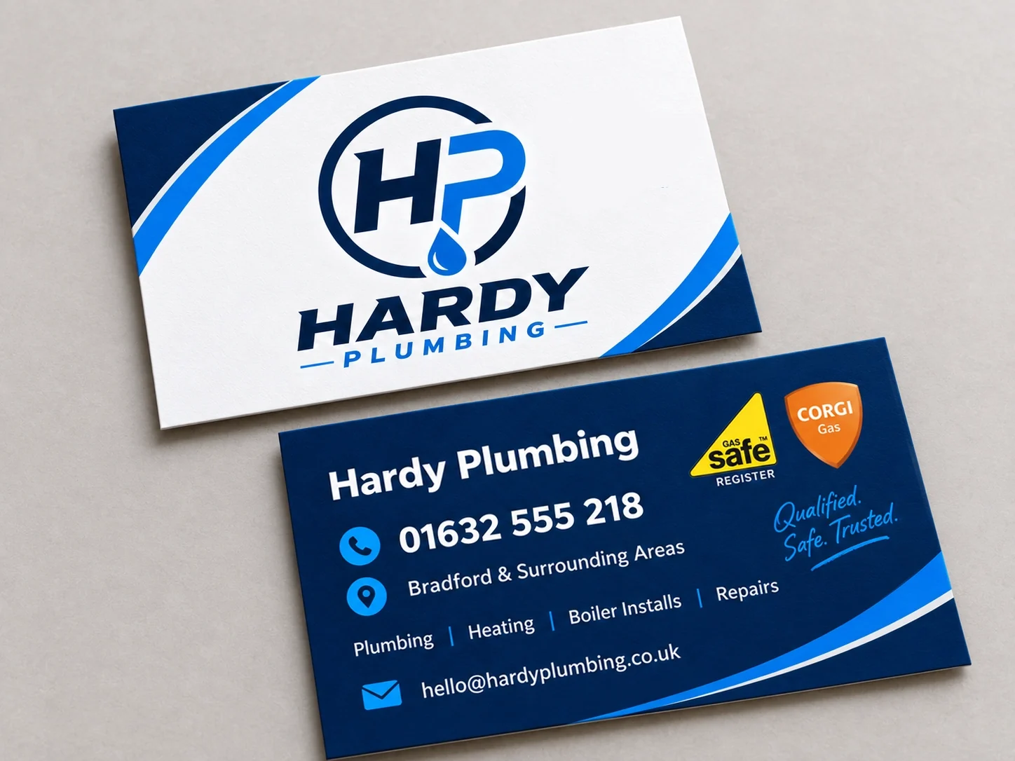
The mark carries the front on its own, with no contact detail competing for attention. Everything a customer needs to actually ring up goes on the navy reverse, in reading order: name, number, area, services, email.
Case studies — Hardy Plumbing
Hardy Plumbing already had the beginnings of a distinctive idea. The problem was that there were too many ideas competing for attention.
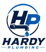

The original logo combined an HP monogram, pipework, a tap, a water drop and a circular device.
Individually, several of those elements made sense. Together, they made the logo unnecessarily complicated.
At small sizes the detail became harder to read, and on a van or work shirt there wasn’t one strong element for the eye to remember.
The HP monogram was the strongest part of the original identity, so that became the starting point.
The plumbing connection also needed to remain obvious.
The aim wasn’t to disguise what Hardy does. It was to communicate it more simply.
Instead of adding plumbing symbols around the initials, we made the water drop part of the monogram itself.
That allowed us to remove the extra tap, pipework and surrounding elements.
We strengthened the typography, improved the proportions and created a much cleaner overall shape.
The rebuilt mark sets a repeatable visual language: two defined blues, a confident wordmark and a monogram that can stand on its own wherever the full logo will not fit.
The test of a trade logo is not the screen it was drawn on. These are the two places it does most of its work — handed across a doorstep, and parked outside a job for a day.
The mark carries the front on its own, with no contact detail competing for attention. Everything a customer needs to actually ring up goes on the navy reverse, in reading order: name, number, area, services, email.
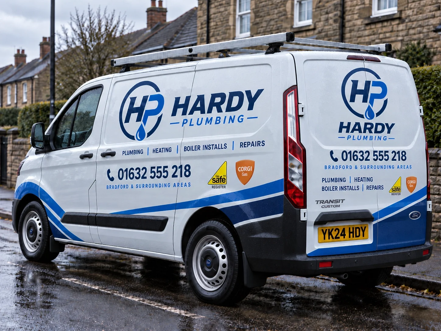
Signwriting is where the rebuild pays off: two flat colours cut cleanly as vinyl, and the horizontal lockup fills the panel without the drop or the letters closing up. The number stays the biggest thing after the name, because that is what people read from behind.
There is now one clear idea instead of several competing ones.
The logo is easier to recognise, easier to reproduce and much stronger when it’s seen quickly on a van, uniform or sign.
Most importantly, it still belongs to the same business.
Hardy Plumbing didn’t need a completely different identity. It needed a clearer one.
Every project here follows the same principle: keep what customers already recognise, rebuild what is holding it back. See all case studies →
 Northline Gardening Services
Read the study →
Hardy Plumbing
Current study
Northline Gardening Services
Read the study →
Hardy Plumbing
Current study
 AnswerReady
Read the study →
AnswerReady
Read the study →