
 AnswerReady
Current study
AnswerReady
Current study
Case studies — AnswerReady
Turning a generic idea into something ownable.
AnswerReady needed to communicate answers, search and trust without looking like every other technology business doing the same thing. The original direction had the right ingredients, but not yet a distinctive enough identity.
Before
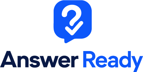
After
The problem
A question mark is an obvious symbol for questions and answers. That’s also the problem. It’s used everywhere.
On its own, it did little to make AnswerReady recognisable as a particular business.
The identity needed something simpler and more distinctive while keeping the ideas of questions, answers and confidence.
What we kept
Blue remained an important part of the colour palette.
The tick also stayed because it communicated the idea of an answer being found or confirmed quickly and clearly.
We weren’t looking for a completely unrelated concept. We wanted to make the existing thinking more distinctive.
What we changed
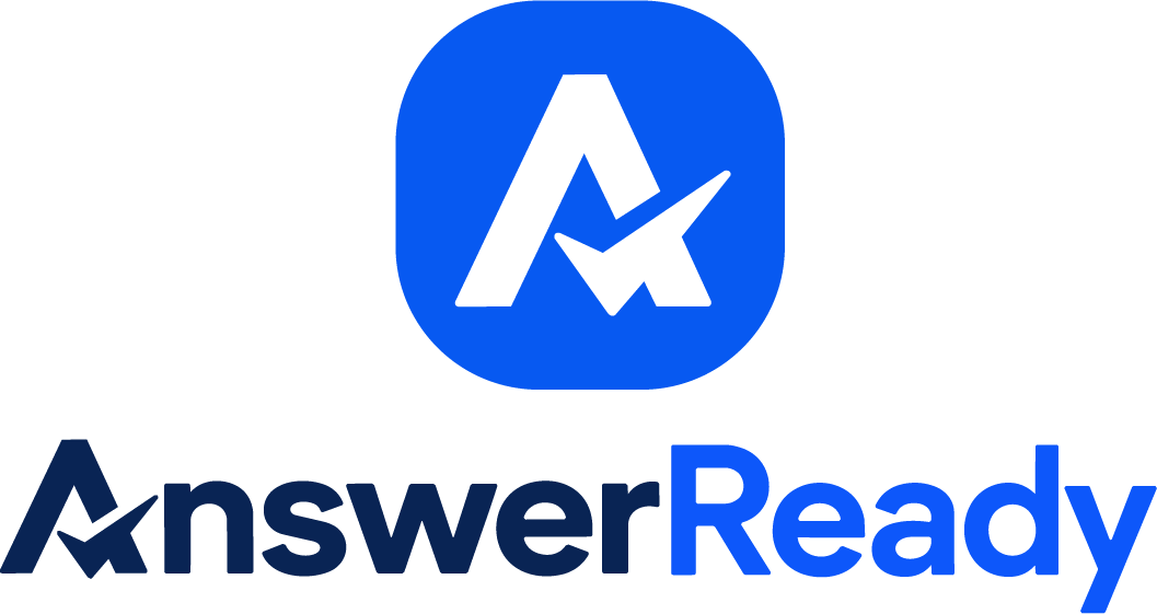
The question mark was developed into a customised symbol built around the letter A.
Rather than having a generic icon sitting next to the company name, the symbol now connects directly to AnswerReady itself.
The typography, spacing and proportions were then refined around it to create a much more consistent identity.
Built for small screens first.
Two blues, one letterform and a symbol that works detached — the pieces a product needs before it starts filling in app stores, browser tabs and profile pictures.
Deep navy
Signal blue
AnswerReadyOne word · one letterform · legible at favicon size
The result
The finished logo still communicates questions and answers, but it now has something much more important. Recognition.
It feels like AnswerReady rather than a generic search or technology company.
A familiar idea, turned into an identity the business can actually own.
More identity work.
Every project here follows the same principle: keep what customers already recognise, rebuild what is holding it back. See all case studies →
Identity 01
 Northline Gardening Services
Read the study →
Identity 02
Northline Gardening Services
Read the study →
Identity 02
 Hardy Plumbing
Read the study →
Hardy Plumbing
Read the study →
Identity 03
AnswerReady
Current study
Northline Gardening Services
Read the study →
Identity 02
Hardy Plumbing
Read the study →
AnswerReady
Current study